


THE NEW YORK TIMES HATES THIS ARTICLE
The problem with year-over-year reporting (clickbait headline, intentionally ironic)


The New York Times gets it wrong
Does anyone remember this article from the New York Times (January 2021)?

In it, reporter Erica L. Green interviewed Clark County, Nevada Superintendant Dr. Jesus Jara. He claimed that since the pandemic (March-December), they experienced “18 suicides over nine months of closure” … double the nine the district had the entire previous year.” Dr. Jara then used this as a justification to re-open schools as soon as possible. (Note, I cannot replicate 18 suicides in the school age bracket occurring in Clark County Nevada for the CDC wonder database, I get 14 no matter how I look; I also get 10 suicides for the 2019 year).
Well, we can actually look at Clark County youth suicide numbers, and we can see that there is a big problem: the number of youth suicides Clark County experienced March-December is in line with 2018 and 2017 numbers, and 2020 was not an “anomaly driven by the pandemic,” rather it was a continuation of a previous trend:

This article went viral, despite it being foundationally and completely wrong. There was no increase in Clark County suicides in the school age population. This article was literally cited in congressional testimony as evidence to-reopen schools, despite it being factually deceptive.
In fact, we saw a strong decrease in suicides during the initial “lockdown period,” across the United States, precisely the opposite of what the NYT and Dr. Jara were claiming in the article. (The same was seen for youth with emergency mental health crises)
Yet, the New York Times was technically right. Why? Because year-over-year, 2020 was a sharp increase from 2019 (I can’t show you the number, but it is a >7 death leap). It’s just, you know, not telling the full picture. Conveniently for newspaper sales, this seems to always occur with a “if it bleeds it leads” direction: we rarely see year-over-year comparisons of decreases in suicides in the headlines. This is the problem: year-over-year comparisons are not very useful when trying to detect trends in events.
And here’s how it went in Clark County Nevada, for the 8-17 age range:
2017 - 12 suicides ← literally the average for the past 10 years
2018 - 20 suicides ← the highest year on record
2019 - 10 suicides ← the lowest year since 2014
2020 - 15 suicides ← higher than 2019 but much lower than 2018
2021 - 14 suicides ← zero appreciable difference
2022 - 11 suicides ←same as 2017 or 2019
How do they do it?
Year-over-year (YOY) sensationalism explained.
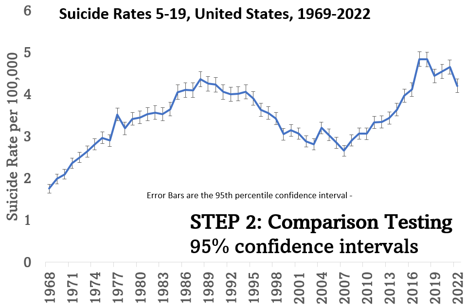
If we take a look at suicides <20 for the United States, going back to 1968, we get the following graph:

Note, there is *never* a flat part. In fact, we can plot the “year over year” change thusly:

So you can almost write the headlines yourself! Let’s do it for the period of 2016-2022:
2016 - Child suicide up 4%, due to David Bowie’s Death?
2017 - Trump’s First Year in Office Sees Kid’s Suicides up 18%
2018 - Child Suicides Down 0.1%, CDC Reports (very unlikely to be a headline, yay bloodthirsty media, in fact, the only 2018-reporting i can find from the NYT involves the combination of drug overdose and suicide deaths to report a headline of 16% increase)
2019 - As Child Suicides Down 8% - Did “Joker” Help?
2020 - PANDEMIC! Youth Suicides Up 2.3%!
2021 - PANDEMIC!!!!!! YOUTH SUICIDES UP 2.5%!!!!
2022 - Youth suicides down 10%, but let’s talk about adult rates increasing or drug overdoses instead.
You get the point; you can basically get your number and then tell the story you think is most interesting.
Defend yourself against “year over year” sensationalism
There are three easy tricks to “defeat” this form of sensationalism:
TRY TO VISUALIZE THE LONG TERM TREND OR GRAPH YOURSELF. This does not require any math skills, just your brain and looking at the whole picture. Even people without sight can hear the yearly numbers and think about the trends!

DO SOME TYPE OF STATISTICAL COMPARISON (requires some math!)
When you do this, you can see if a number is likely significantly different than the previous number. We’re still prone to trend errors, but it stops us from leaping on a 0.5% rate change. Here’s the graph above but this time with 95% confidence intervals attached. The bar of 2020 (3rd from left) overlaps with the bar from 2019 (4th from left), telling you that this change is not statistically significant.

DO TREND ANALYSIS (requires advanced math)

How advanced? In the time it took my to write this post, the trends were being analysed. I typically use JOINPOINT software which is available for free from the CDC. This is probably the best way, truly, to detect trends.

Using these advanced algorithms, there are 4 “joinpoints” (trend shift years): 1975 there is a bend in the trend, in 1989 the increasing trend reverses, in 2007 the decreasing trend reverses, and in 2018 the increasing trend flattens.
I doubt we’ll ever see and end to this, in fact, the “fake” headline I put at the header of this post could be really something we see - suicide rates DID increase year over year 4% in Americans, but what will be hidden by the media is that it is identical to the 2018 rate of suicide.
Of course they are. Those who are getting zero help with vaccine injury are killing themselves.